Theming Basics
By Lex Li
This page shows you the basics about DockPanel Suite themes (2.11+).
The Structure of A Theme
A theme is a collection of multiple elements which control the rendering effect of DockPanel Suite.
public class VS2012LightTheme : VS2012ThemeBase
{
    public VS2012LightTheme()
        : base(Resources.vs2012light)
    {
    }
}

public abstract class VS2012ThemeBase : ThemeBase
{
    public VS2012ThemeBase(byte[] resources, IDockPaneSplitterControlFactory splitterFactory, IWindowSplitterControlFactory windowsSplitterFactory)
    {
        ColorPalette = new DockPanelColorPalette(new VS2012PaletteFactory(resources));
        Skin = new DockPanelSkin();
        PaintingService = new PaintingService();
        ImageService = new ImageService(this);
        ToolStripRenderer = new VisualStudioToolStripRenderer(ColorPalette);
        Measures.SplitterSize = 6;
        Measures.AutoHideSplitterSize = 3;
        Measures.DockPadding = 6;
        ShowAutoHideContentOnHover = false;
        Extender.DockPaneCaptionFactory = new VS2012DockPaneCaptionFactory();
        Extender.AutoHideStripFactory = new VS2012AutoHideStripFactory();
        Extender.AutoHideWindowFactory = new VS2012AutoHideWindowFactory();
        Extender.DockPaneStripFactory = new VS2012DockPaneStripFactory();
        Extender.DockPaneSplitterControlFactory = splitterFactory ?? new VS2012DockPaneSplitterControlFactory();
        Extender.WindowSplitterControlFactory = windowsSplitterFactory ?? new VS2012WindowSplitterControlFactory();
        Extender.DockWindowFactory = new VS2012DockWindowFactory();
        Extender.PaneIndicatorFactory = new VS2012PaneIndicatorFactory();
        Extender.PanelIndicatorFactory = new VS2012PanelIndicatorFactory();
        Extender.DockOutlineFactory = new VS2012DockOutlineFactory();
        Extender.DockIndicatorFactory = new VS2012DockIndicatorFactory();
    }

    public override void CleanUp(DockPanel dockPanel)
    {
        PaintingService.CleanUp();
        base.CleanUp(dockPanel);
    }
}
2.11 release introduces the new palette based skins, which makes creating new themes much easier.
By exporting .vstheme files from Visual Studio Color Theme Manager, and injecting them into the constructor
of DockPanelColorPalette, the theme can extract the necessary colors from them.
Note
Visual Studio 2010 Color Theme Manager exported .vstheme files are not supported yet as it uses a different schema.
DockPanelSkin was a simple container of different kinds of colors. It was mainly developed for
Visual Studio 2005 theme.
The ThemeBase class allows its rendering effect to be further changed by overriding properties of its
Extender property. The above sample shows that multiple elements are customized,
DockPaneCaption
DockPaneStrip
DockPaneSplitter
AutoHideStrip
AutoHideWindow
DockWindow
DockWindowSplitterControl
DockOutline
PaneIndicator
PanelIndicator
Measures stores several numbers that control size/length of a few controls. SplitterSize and
AutoHideSplitterSize is here to control the sizes of splitters.
CleanUp method should be implemented if a customized IPaintingService implementation is used
to clean up GDI+ resources.
You can refer to each of the factory classes to see how a specific part of the theme is customized. Below we will simply check what exactly the above names are there in a theme by highlighting them in screen shots.
Visual Elements of A Theme
Here is a full screen shot of an application that uses DockPanel Suite.
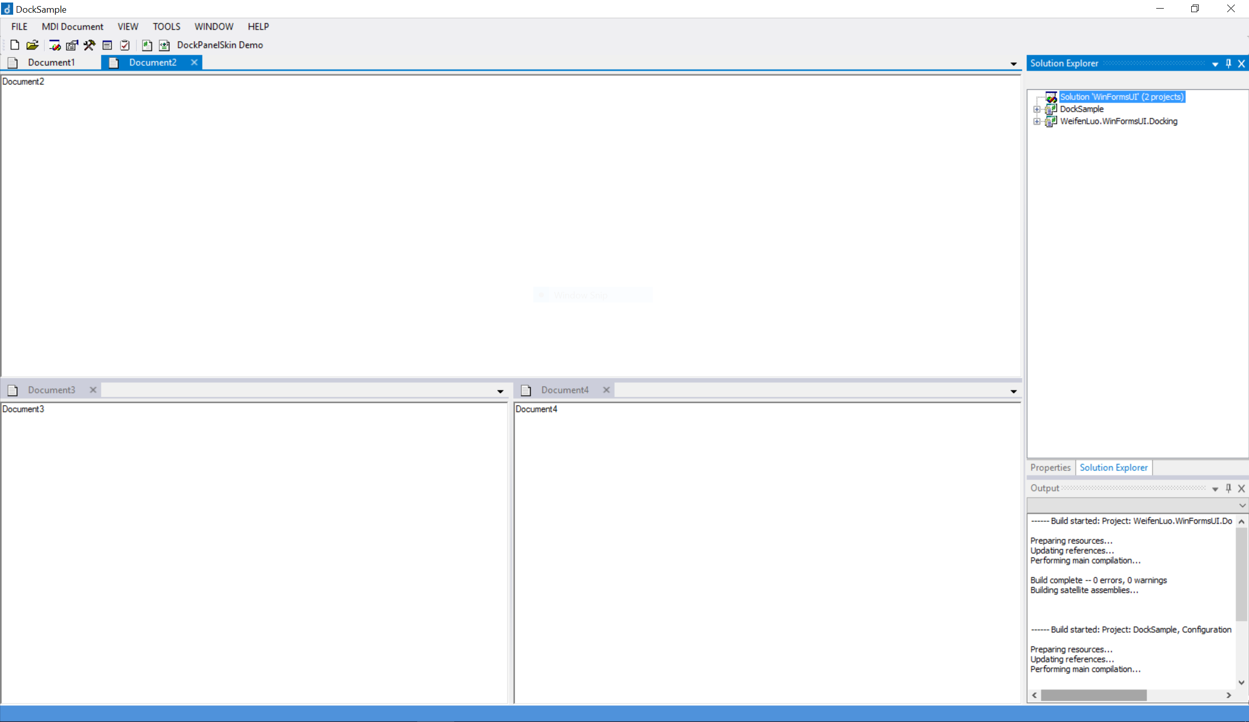
Figure 1: A DockPanel Suite enabled application.
So generally speaking, such an application employs multiple dock panes, which are highlighted,
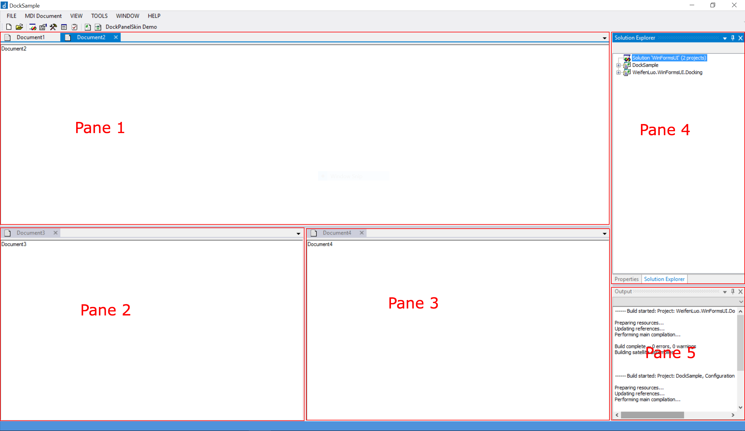
Figure 2: Dock panes highlighted.
You can see five panes are there and between panes, splitters are rendered.
A simple pane (such as pane 2 and 5) only contains a single dock content, but a complex pane (such as pane 1 and 4) can contains multiple dock contents.
For document panes, their strips (shown in red rectangle below) contain the tabs of the documents and are rendered at top, where clicking on a tab can switch to a document,
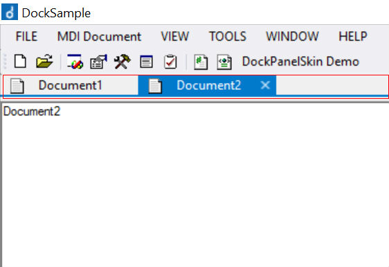
Figure 3: Document pane with its strip highlighted
For tool window panes, their strips (shown in blue rectangle below ) contain the tabs of the tool windows and are rendered at bottom, where clicking on a tab can switch to a tool.
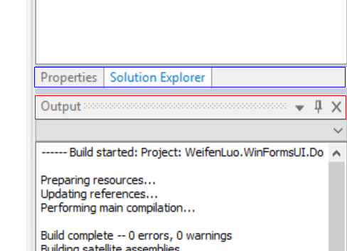
Figure 4: Tool panes. The top pane has its strip highlighted in blue. The bottom pane has its caption highlighted in red.
Visual Studio 2012 themes use separators between adjacent tool window tabs, while Visual Studio 2013 and above uses more complicated borders.
Tool window pane strip is suppressed if the pane only contains a single tool window.
Tool window panes also have their captions (shown in red rectangle above) rendering at top, where the tool window can be closed or hidden.
When a visible tool window pane becomes auto-hide, it would be rendered on an auto-hide strip as a tab,
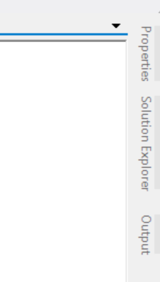
Figure 5: Auto-hide strip showed on the right hand side.
When this auto-hide tool window tab is activated, the tool window slides out and shows in an auto-hide window,
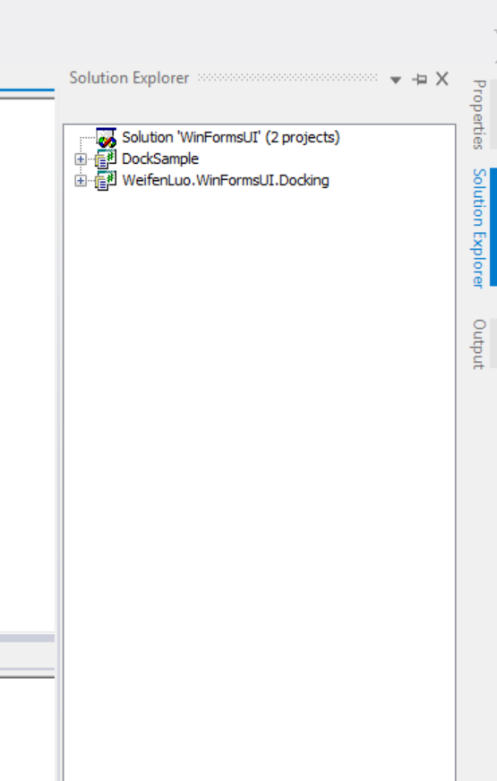
Figure 6: Auto-hide window popped up.
When a dock content is dragged and move over the dock panel area, indicator icons are displayed to show which target locations this content can be dropped at, and the outline (the blue rectangle in the figure) of the content will also be rendered to show how the content would look like once dropped.
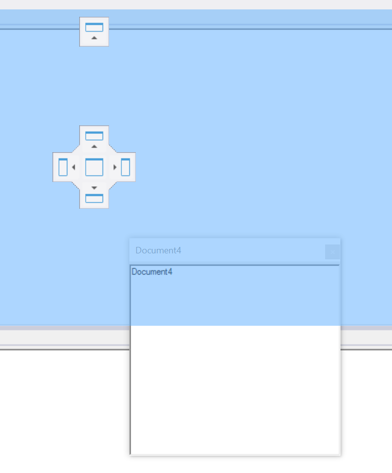
Figure 7: Dock indicator showed when a document is dragged and dropped.
It is very important to understand such elements and then you can see how the Extender mechanism works.
Internally the method ThemeBase.ApplyTo can be used to associate themes with context menu strips and other
menu strips. If you are developing an application, this method allows the theme renderer be used for other menu
strips outside of DockPanel Suite scope.